Brand Identity ⁕ Logo Design ⁕ Website Design ⁕ Illustration
1E: Work Wonders
The Challenge: IT software is often perceived as static and invisible. 1E needed a complete brand evolution that moved away from the traditional tech aesthetic toward something joyful, vibrant, and energetic. The goal was to create a visual language that felt as seamless and supportive as the software itself.
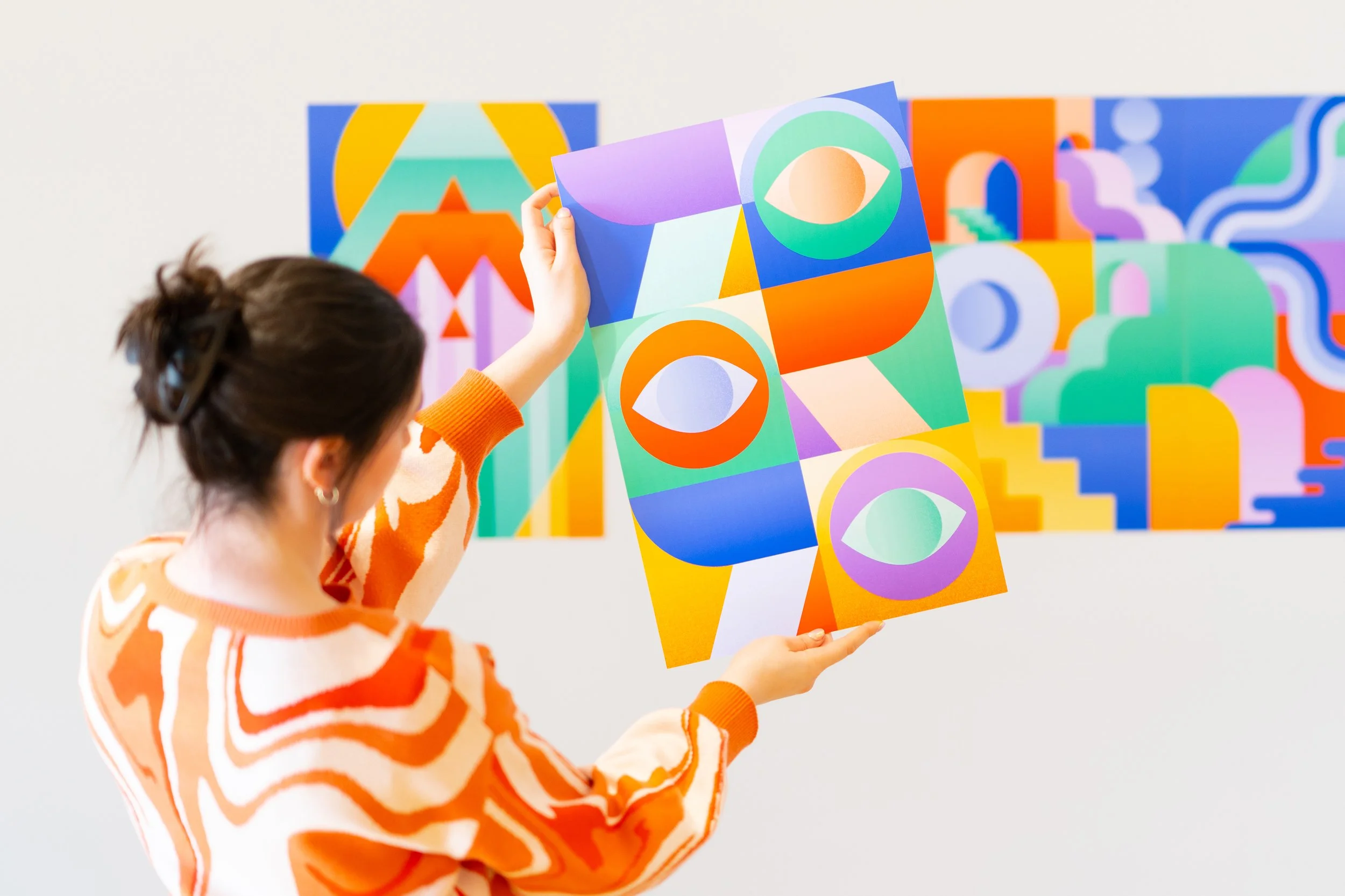
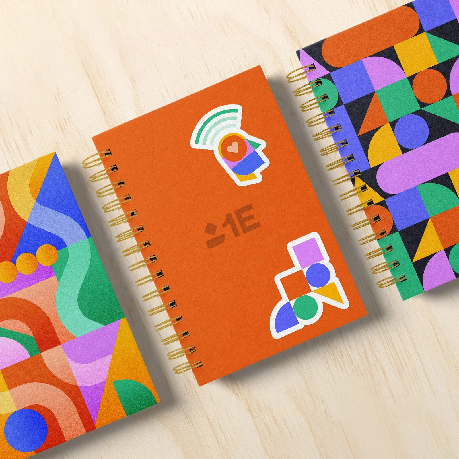
The Solution: Inspired by the tagline “Work Wonders,” we developed a system of simple geometric shapes that act as the backbone of the brand. These “wonders” are infinitely reconfigurable, representing the steady, unobtrusive flow of IT support. To launch the brand internally, I developed a 5-part collectible poster series based on a myriorama — a holistic picture whose components can be infinitely rearranged to represent 1E’s core values.
🏆 Silver Award for Poster Campaign - AdFed MN - The Show 2023
Copywriting: Erin Mackaman
Creative Direction: Andrew Beckman